OPAC EYEWEARLOOKING IS not SEEING
BRAND IDENTITY • CREATIVE DIRECTION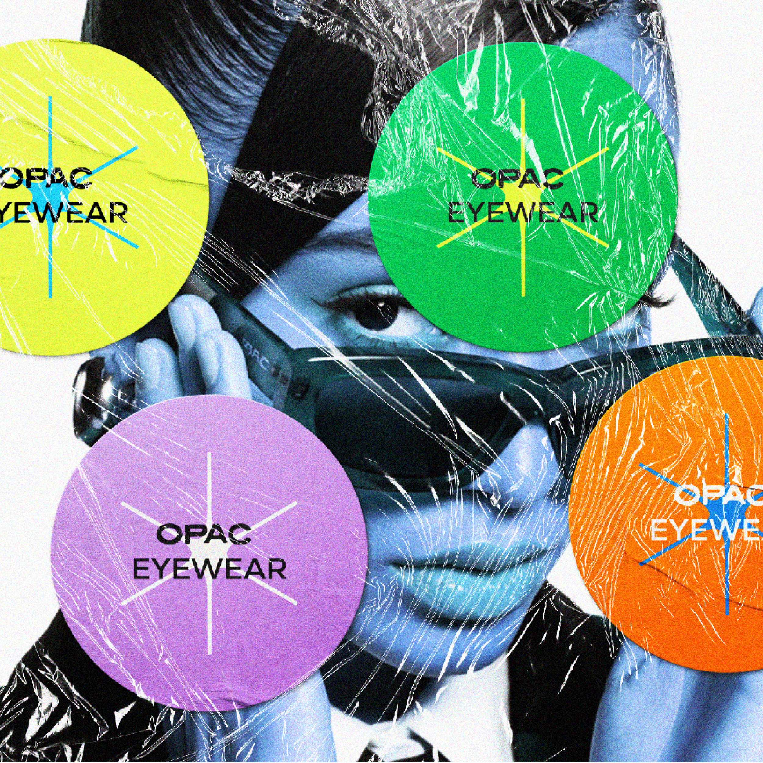
Creating a bold eyewear brand that challenges perception through sculptural design, provocative storytelling, and a distinctive editorial identity. See how I approach brand identity and creative direction.
01.
A BRAND DESIGNED
TO BE SEEN
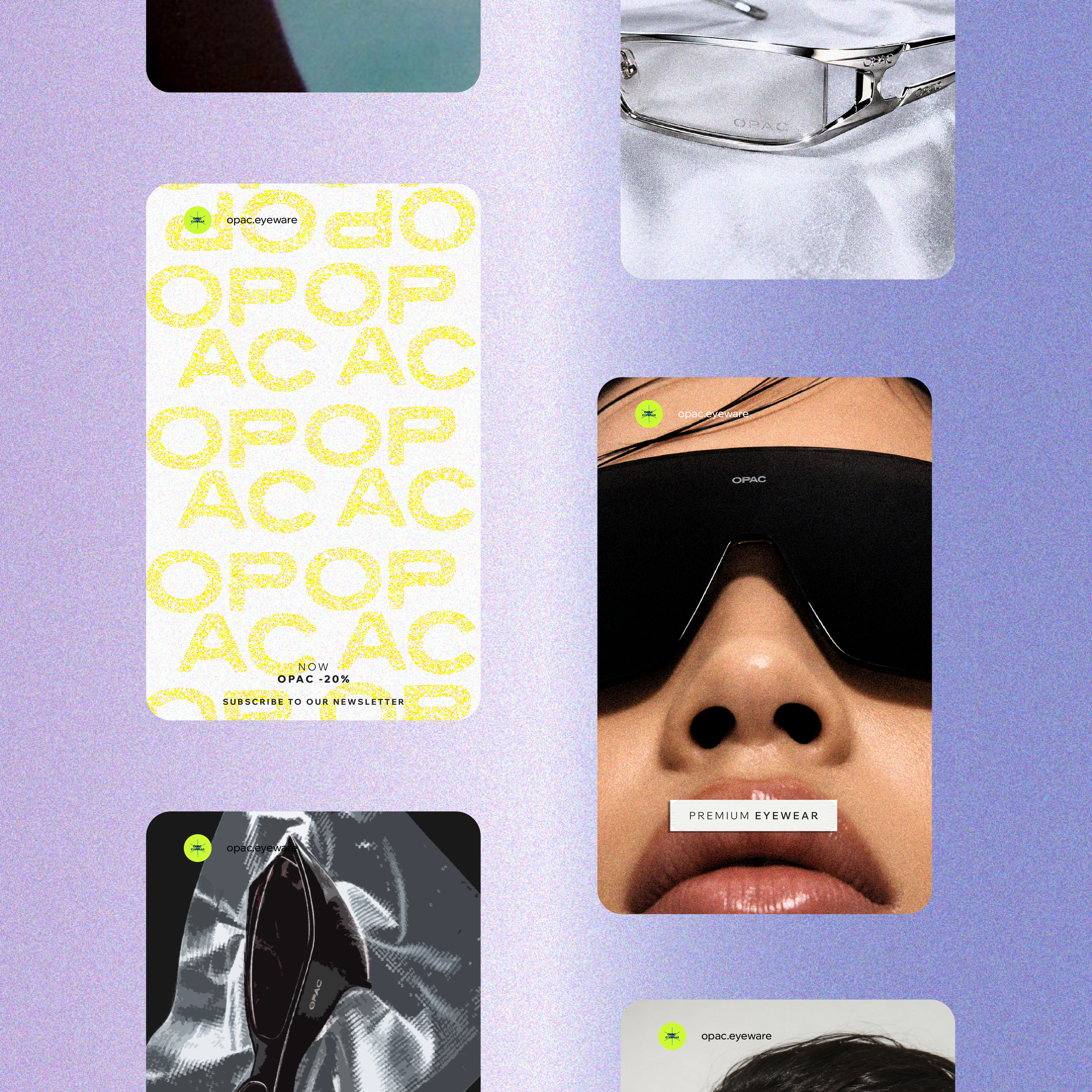
OPAC was created for people who do not simply follow what is visible. They question it, reinterpret it, and shape their own perspective.
The brand needed an identity that felt premium and fashion-led without becoming predictable. It had to feel confident, modern, and slightly rebellious, speaking to a culture-driven audience that sees eyewear as part of their identity.
02.
A NEW PERSPECTIVE on EYEWEAR
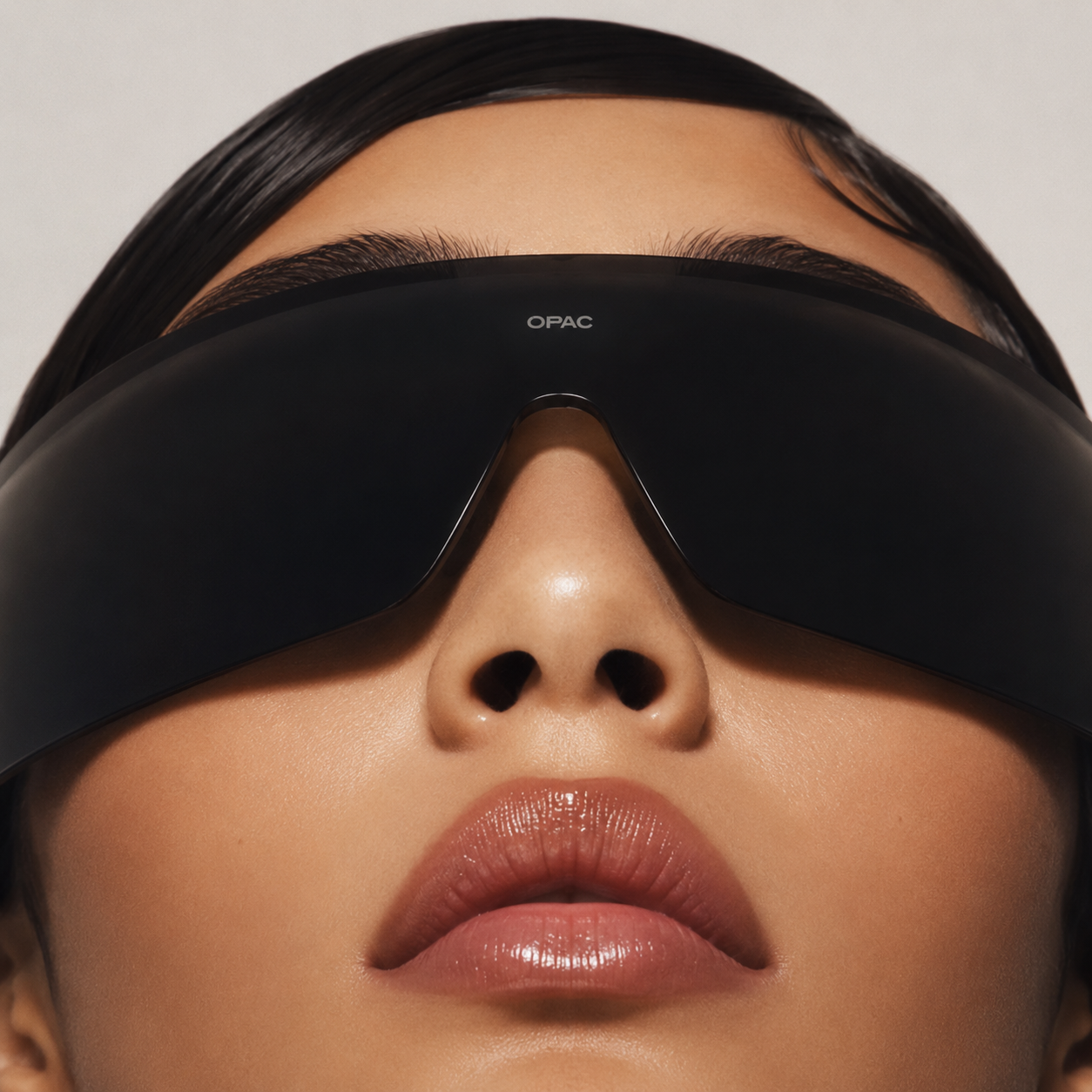
The product and campaign direction was created to position the eyewear as more than an accessory.
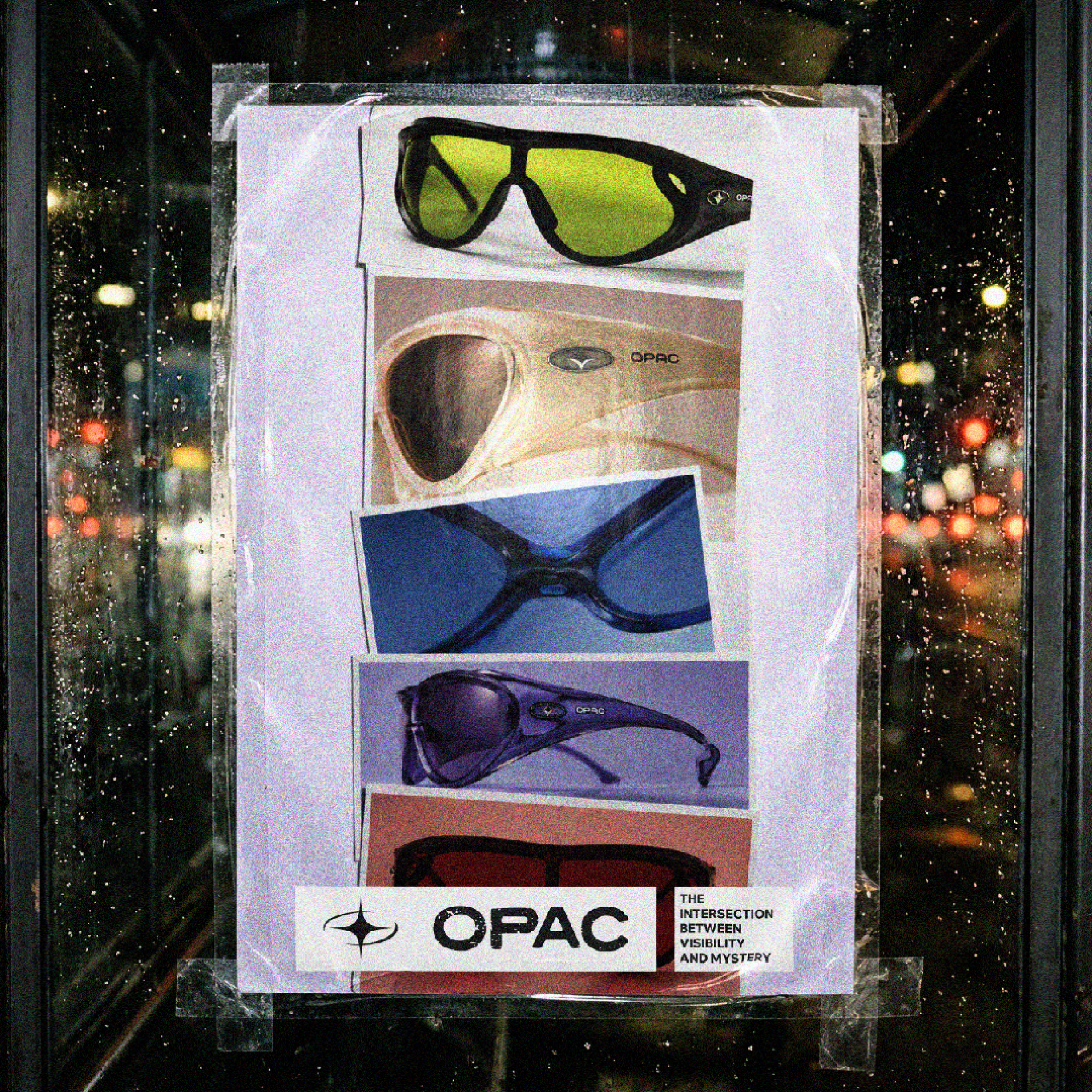
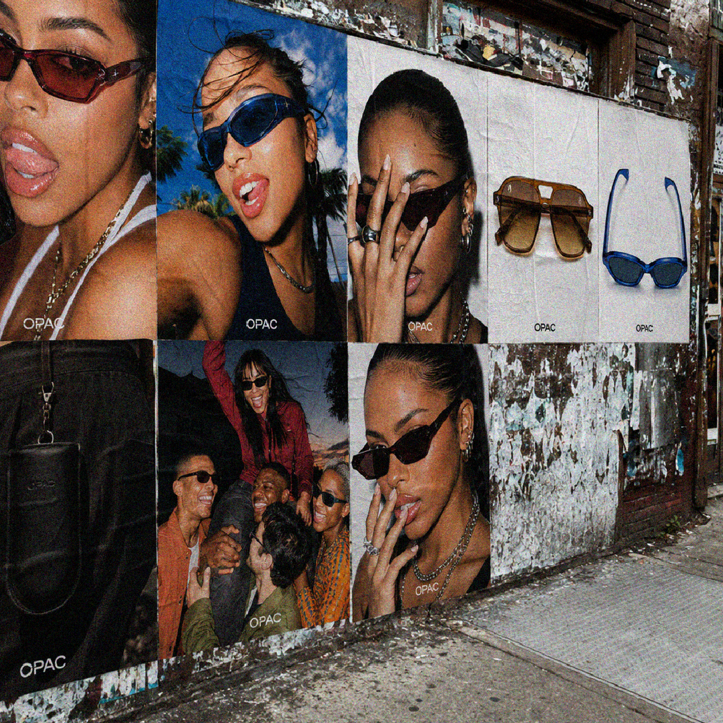
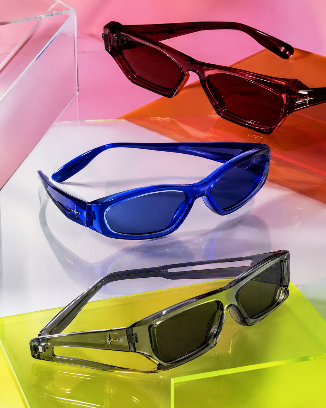
Sculptural frames, tinted lenses, glossy finishes, and chrome details give each design a bold physical presence. The campaign imagery combines cropped faces, direct flash, imperfect movement, and unexpected compositions to create the feeling of being caught in a moment.
The result is an identity that feels polished yet disruptive, balancing premium design with raw cultural energy.
03.
STRATEGY FIRST,
design SECOND
The creative direction was built around the idea that looking and seeing are not the same thing.
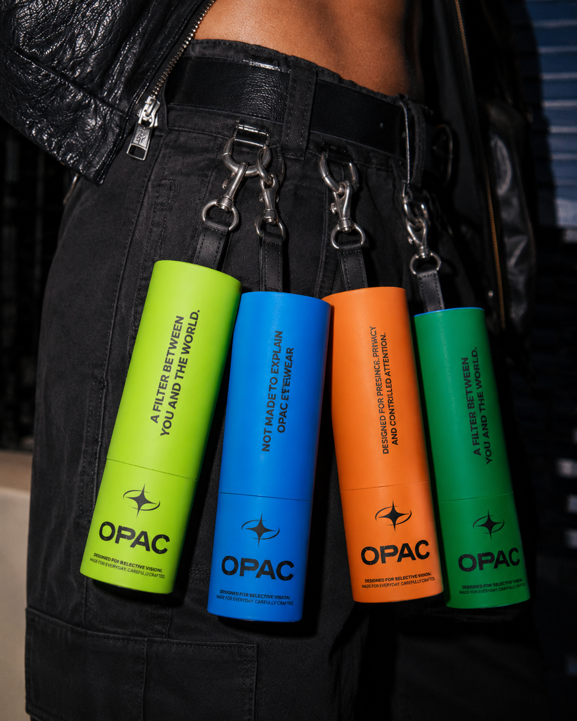
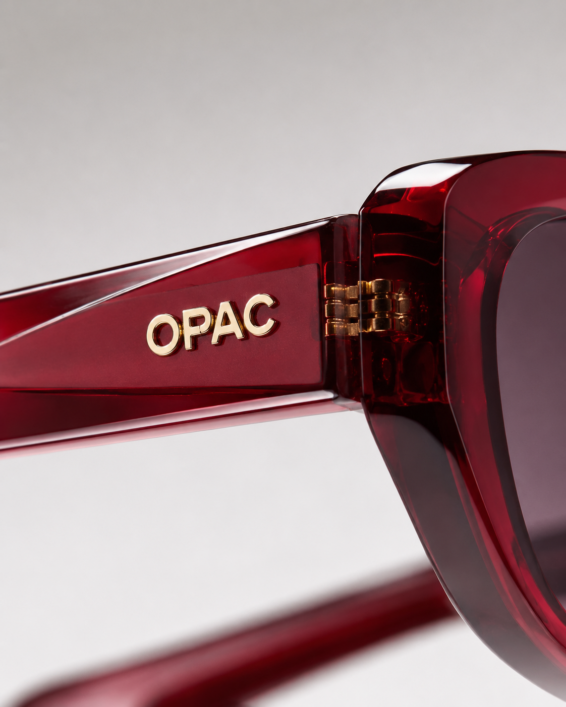
This concept shaped a visual identity inspired by obscured faces, reflective surfaces, camera flashes, and distorted perspectives. A rounded wordmark, abstract lens symbol, bold typography, and a high-contrast colour palette were developed to give OPAC a strong and recognisable presence.
Deep black, warm off-white, oxblood red, smoky grey, and chrome silver create a visual world that feels cinematic, mysterious, and fashion-forward.
Every element was designed to reinforce the brand’s central message: what you see depends on how you choose to look.
IN-DEPTH LOOK