SYLENASOFTNESS WITH A STRONGER point of VIEW
BRAND IDENTITY • CREATIVE DIRECTION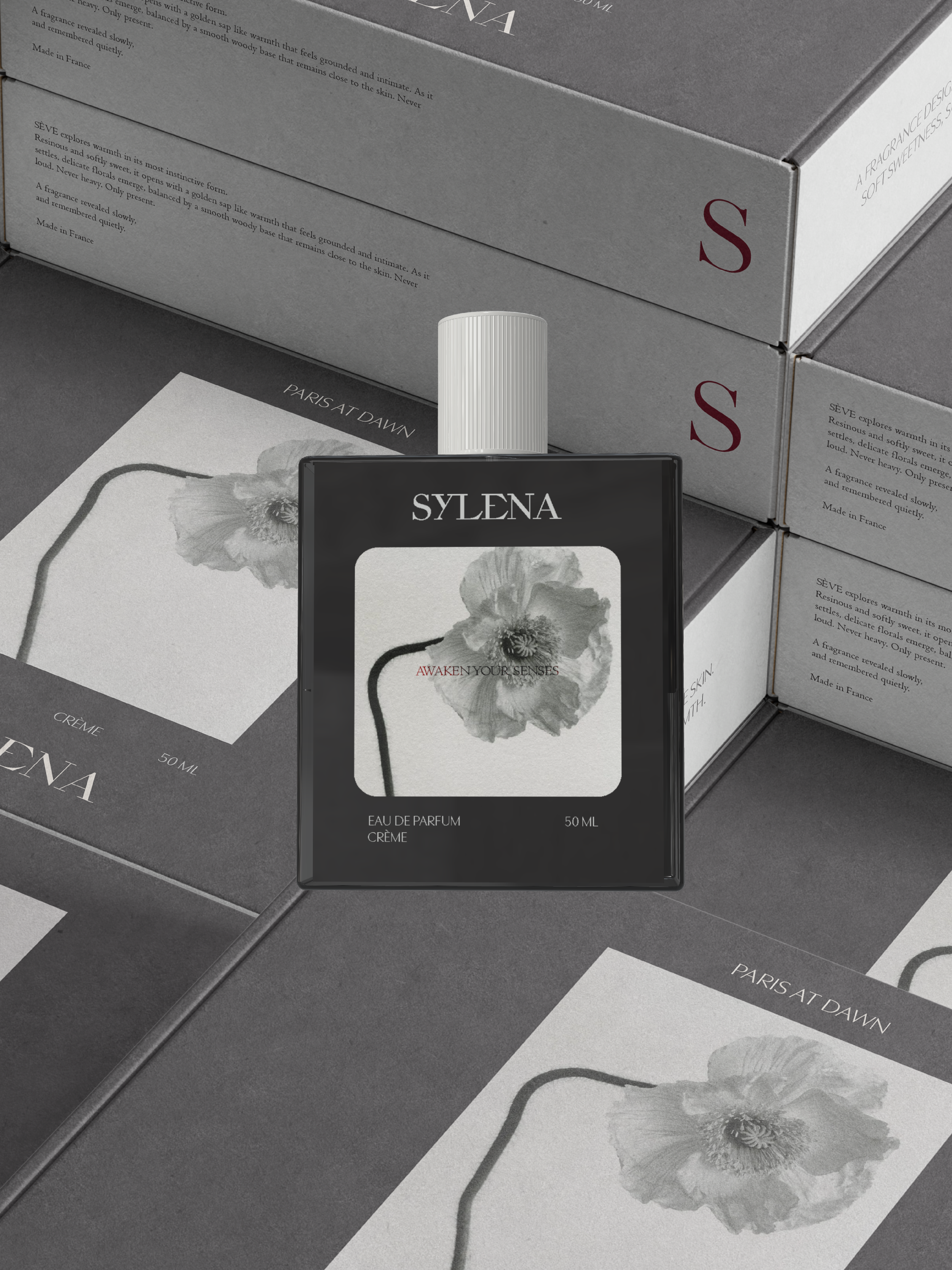
Creating a contemporary feminine brand where softness and character coexist through expressive typography, considered details, and a refined visual language. Explore my brand identity design services.
01.
A DIFFERENT kind of FEMININITY
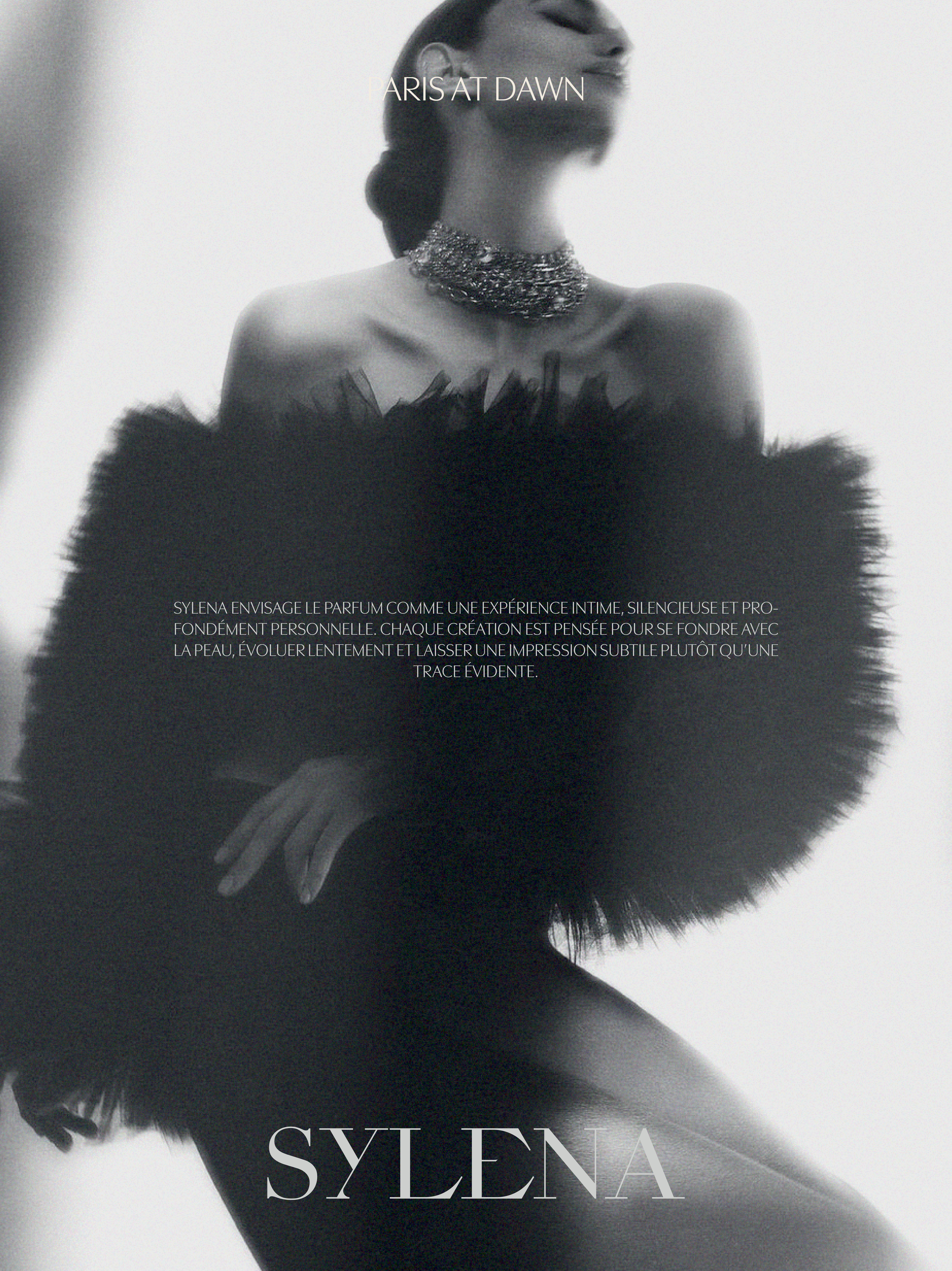
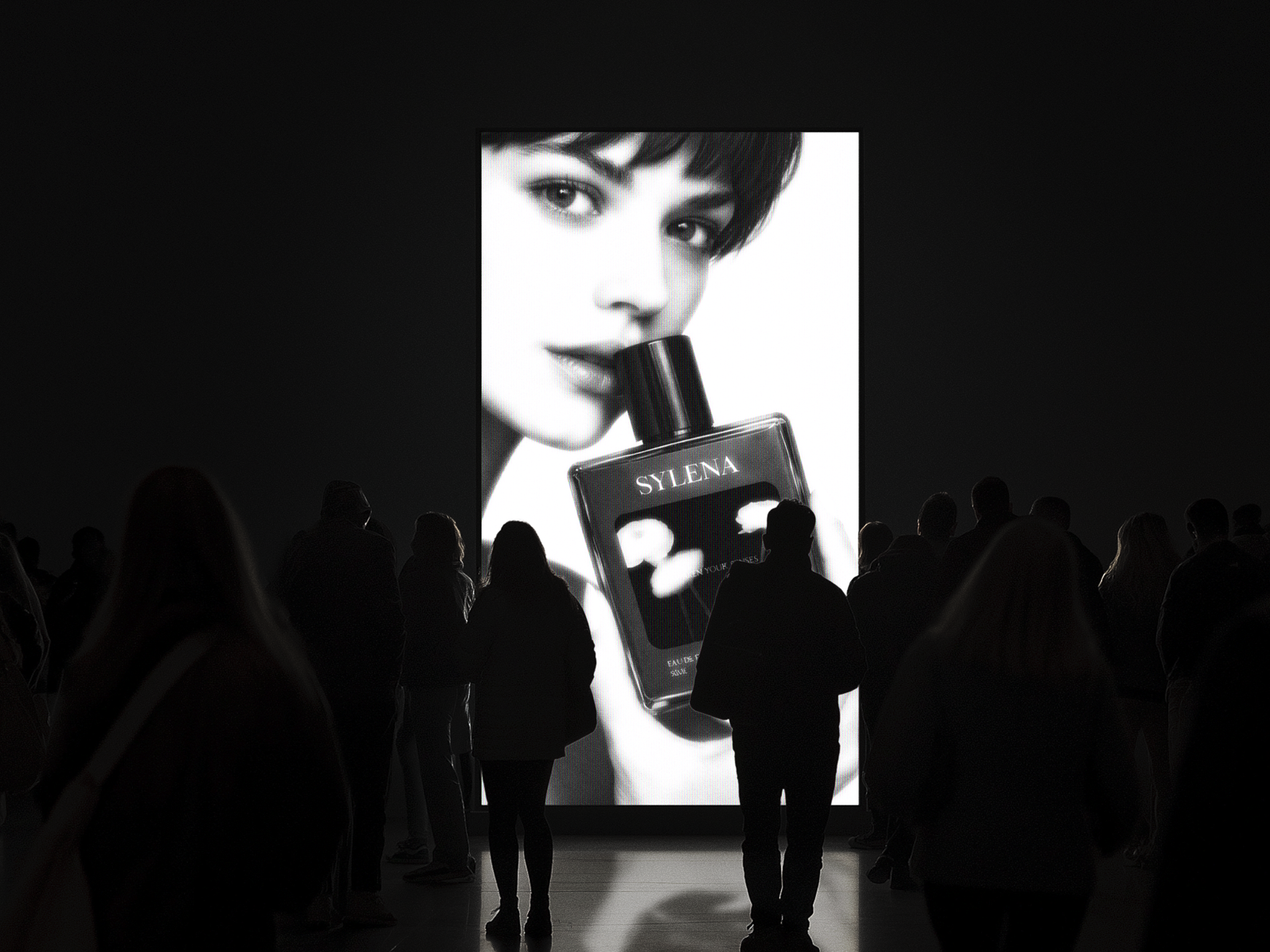
Sylena was created around a more nuanced expression of femininity. One that can feel soft without becoming delicate, elevated without feeling distant, and expressive without relying on the expected.
The identity needed to capture that balance. Something distinctive and emotionally engaging, with enough restraint to feel considered and enough personality to remain recognisable.
02.
STRATEGY FIRST,
design SECOND
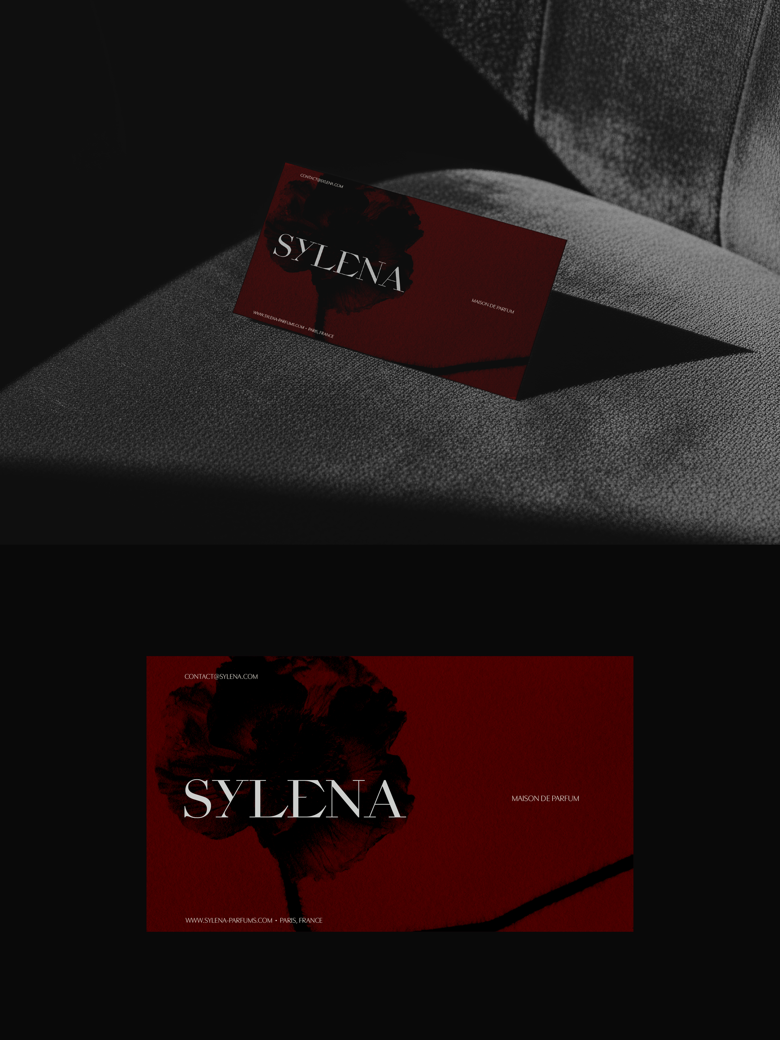
The creative direction was built around contrast: softness and strength, restraint and expression, familiarity and individuality.
This idea informed every part of the visual system, from the typography and proportions to the colour palette, imagery, and supporting graphic elements. The result is an identity that can shift between quieter and more expressive moments while remaining cohesive.
Every detail was designed to give Sylena a visual language of its own, rather than simply fitting into an existing aesthetic.
03.
DESIGNED with
INTENTION
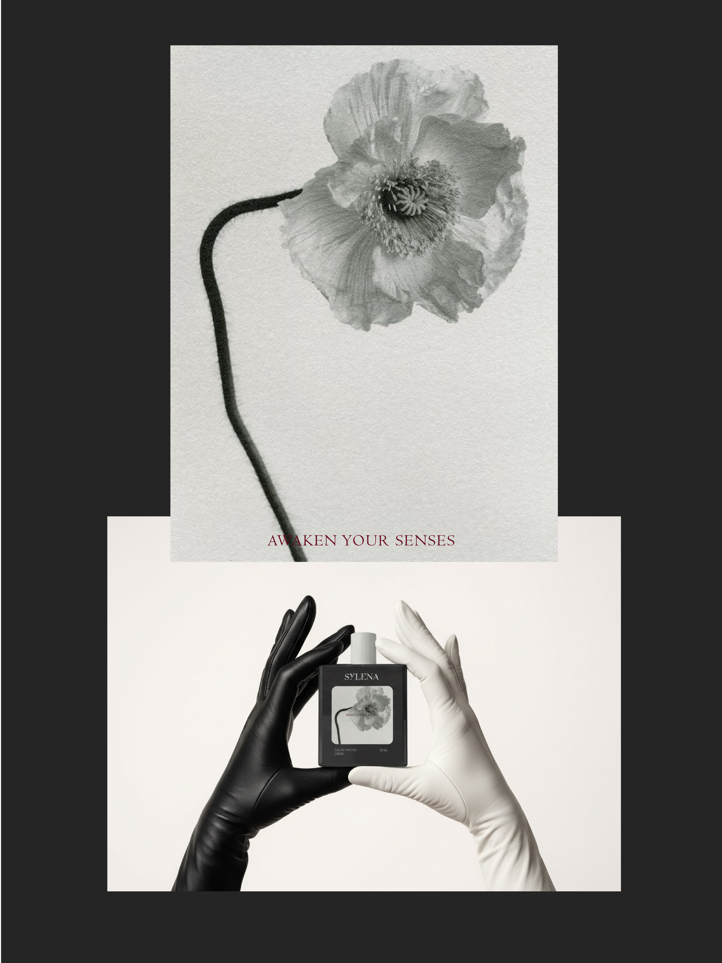
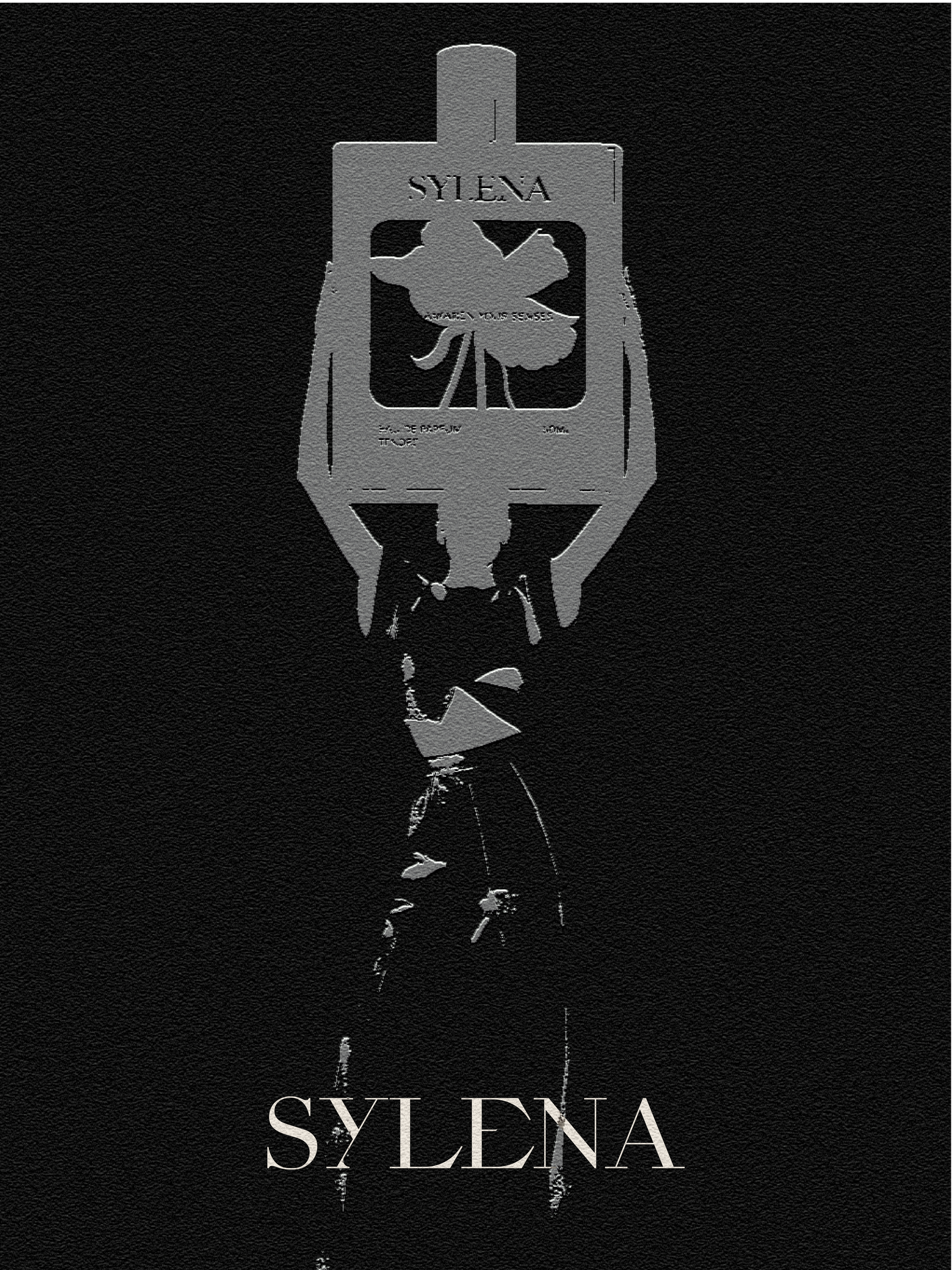
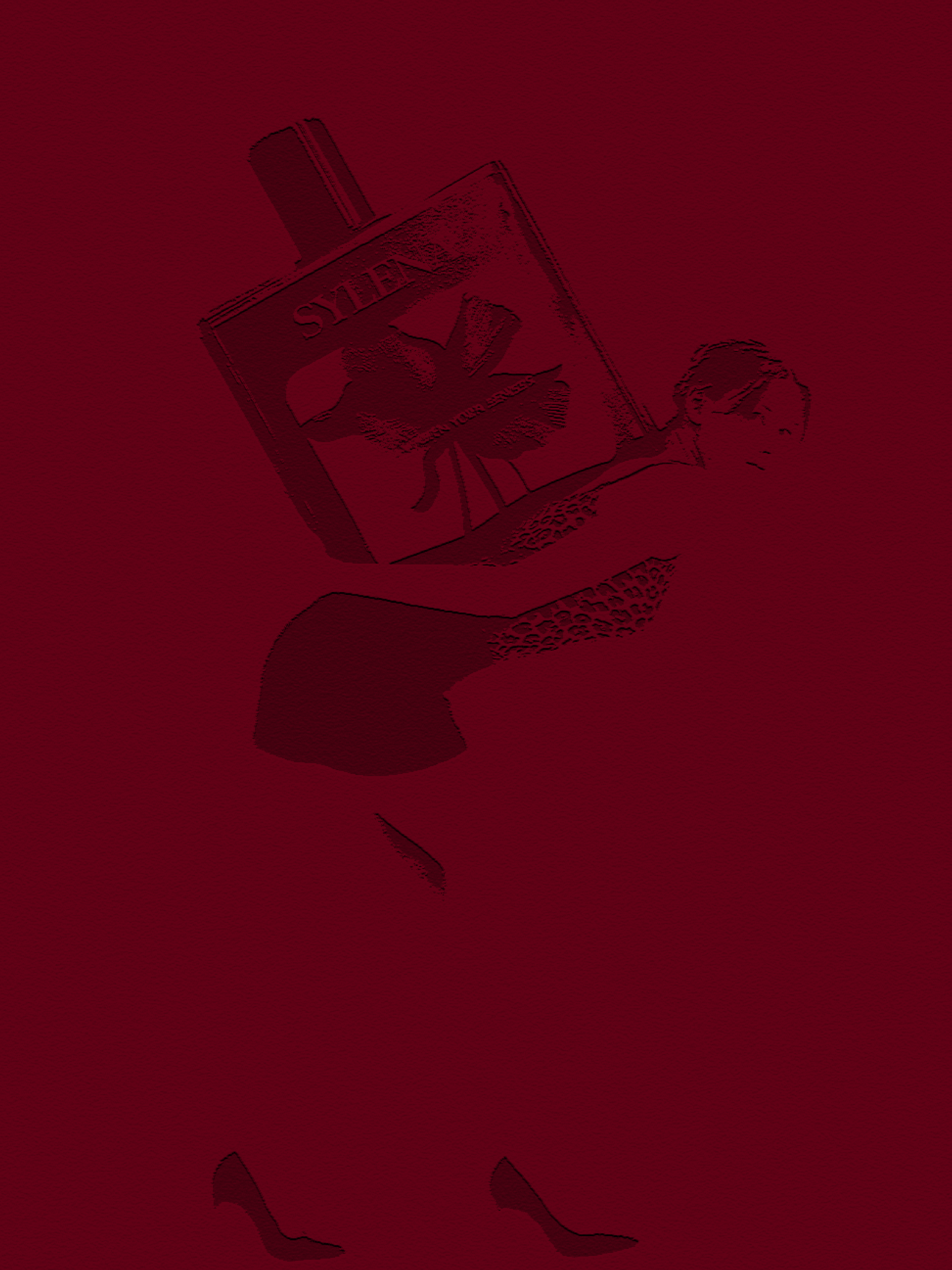
The visual identity brings together expressive typography, subtle organic details, and a carefully controlled composition to create a world that feels unmistakably Sylena.
Rather than relying on decoration, each element has a role within the wider identity. The contrast between softer forms and more structured typography creates tension, giving the brand a presence that feels feminine, contemporary, and self-assured.
IN-DEPTH LOOK